My Account
The modernized Prosper borrower dashboard. I co-led this overhauled redesign for the user account overview. It was one of the first product initiatives for the company-wide rebranding effort to systematically improve our user experience.
- 2015-2016
- UX, UI, Responsive Web Design
- Design Co-Lead – Personal loan borrowers
Modernized fintech design with a clean, simple, and human approach.
Challenges
We identified many points of friction and complaints from our users (loan borrowers) with the legacy dashboard design. These ranged from complex navigation and findability issues to payment-related issues such as double payments, late payments, as well as loan payoff obscurity.
Goals
To provide our users with a better experience when they logged into their accounts. Along with our plan to rebrand and upgrade our system, we aimed to simplify the navigation, personalize the information (e.g. loan status, loan offers), and provide the clear path for primary goals' actions (e.g. making payments).
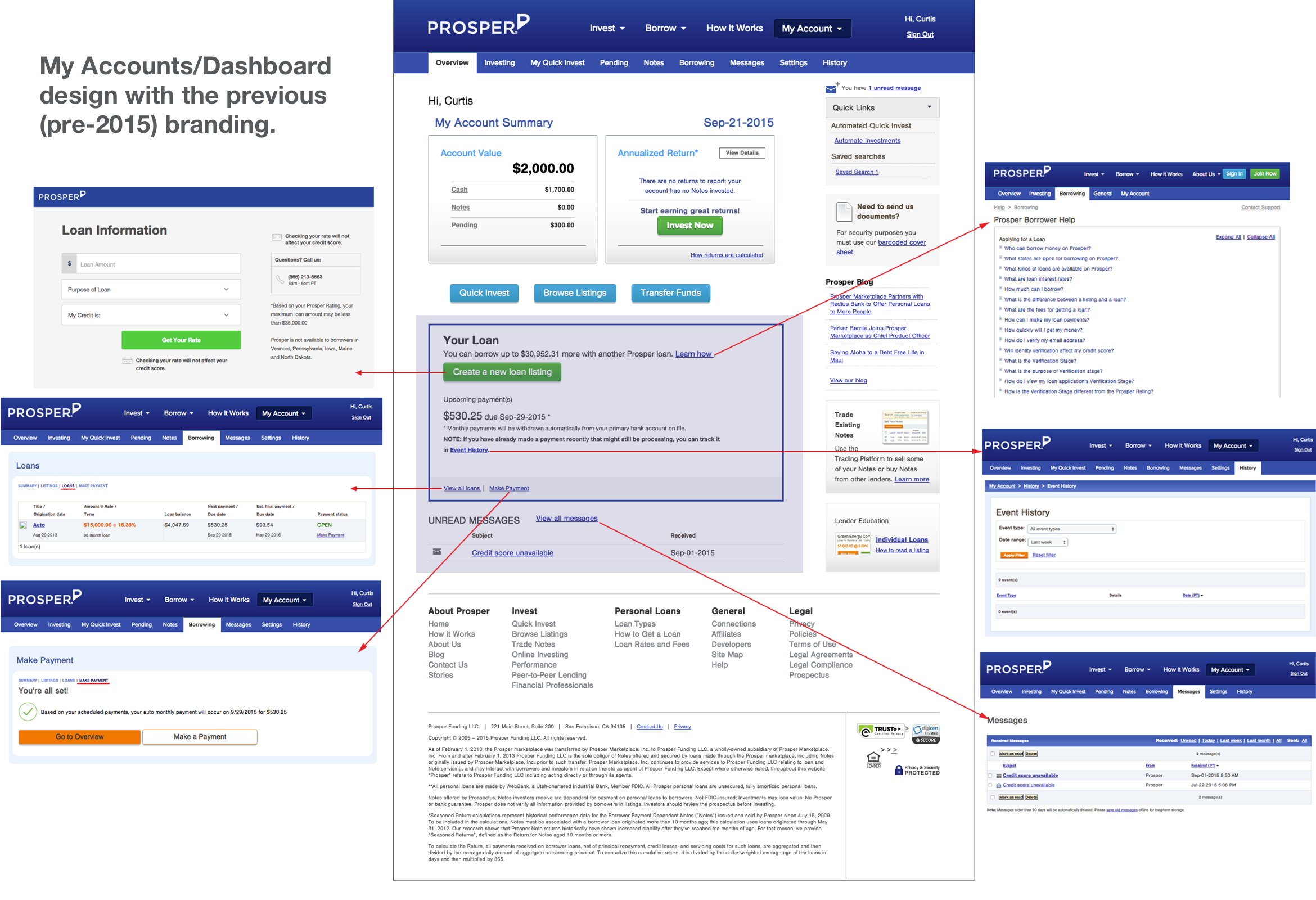
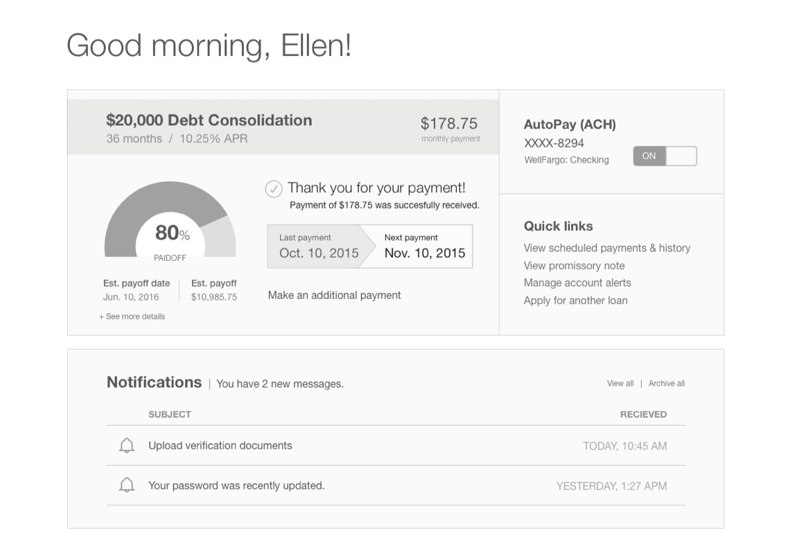
← [LEFT] Legacy design for borrower account dashboard.
Process
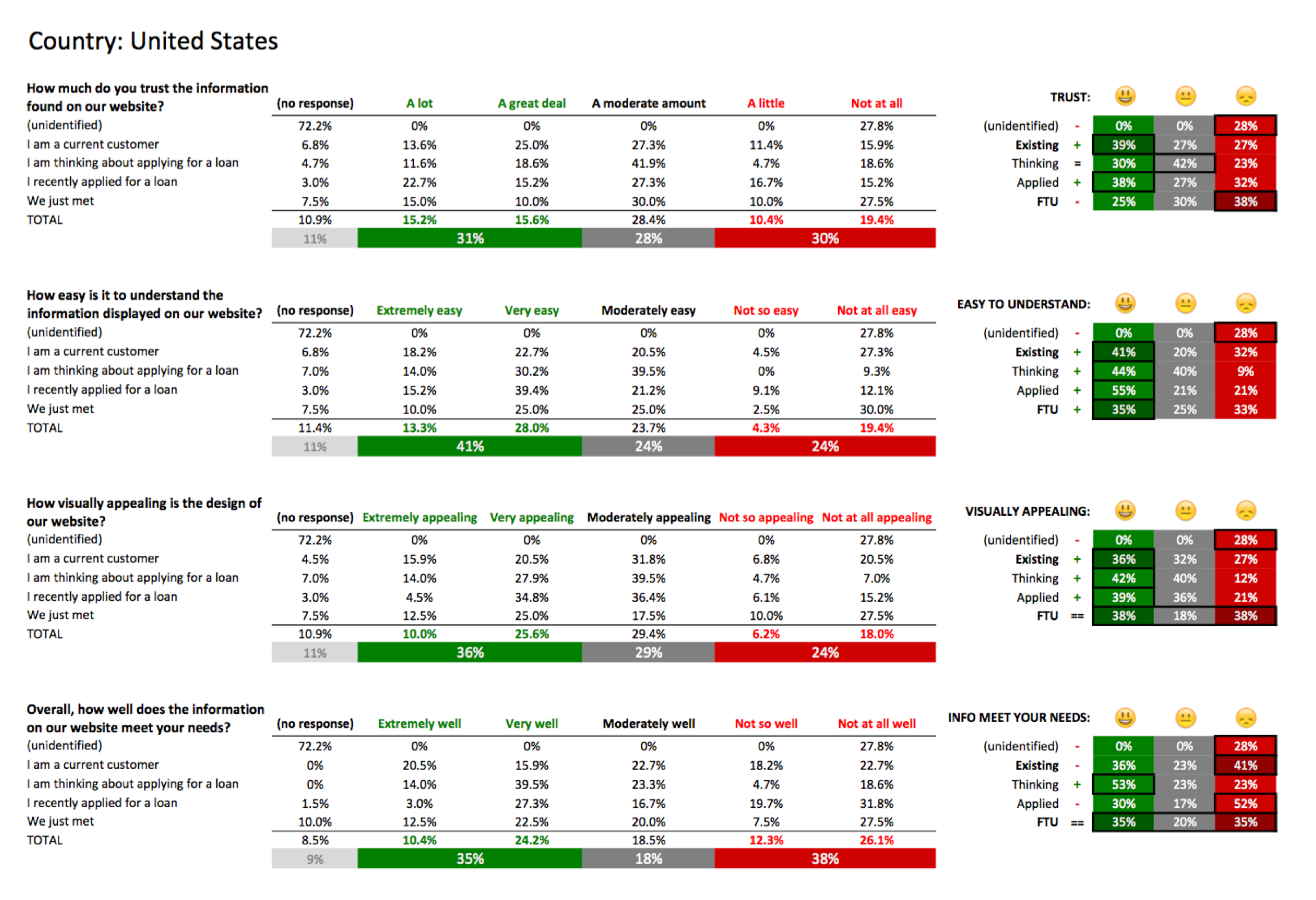
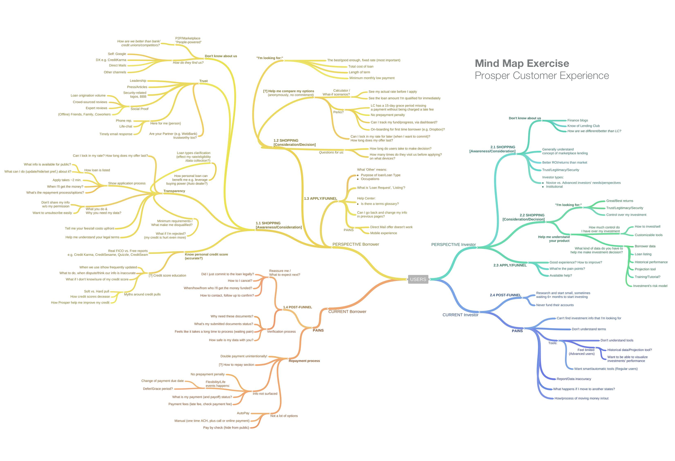
My co-led designer and I gathered the data from our current customers via online surveys as well as collected feedback from the customer service team. To capture and communicate our findings, I quantified the data into a digestible format (see a sample on the left) and created a mind map (see below).
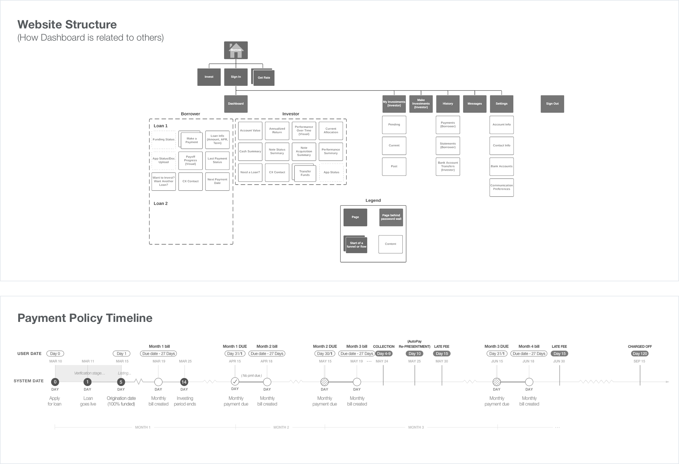
I used the mindmap as a visual thinking tool to structure and synthesize the information during the discovery phase. Because My Account serves as a dual-purposed dashboard for both loan borrowers and investors, the mindmap helped organize thoughts and bridge the information into a big picture. It enabled me to see the relationship between the two-sided marketplace users more holistically.
In conjunction with the user research methods above, we conducted an extensive audit of our sitemap. Then, we recreated the site structure with a more concise information architecture, in which we also incorporated the insights from the card sorting data.
Later, I conducted interviews with our operation team members to understand how our loan product works internally. As a result, I created a comprehensive diagram for our payment policy timeline.
Once we had a solid understanding of our users and our systems, I created user scenarios for our main usage of the dashboard i.e. to see loan status / make loan payments as needed.
Below are samples of an interaction flow for the automatic and manual payments, as well as low-fidelity wireframes during the dashboard concept exploration to help us determine the relevant info for the overview page.
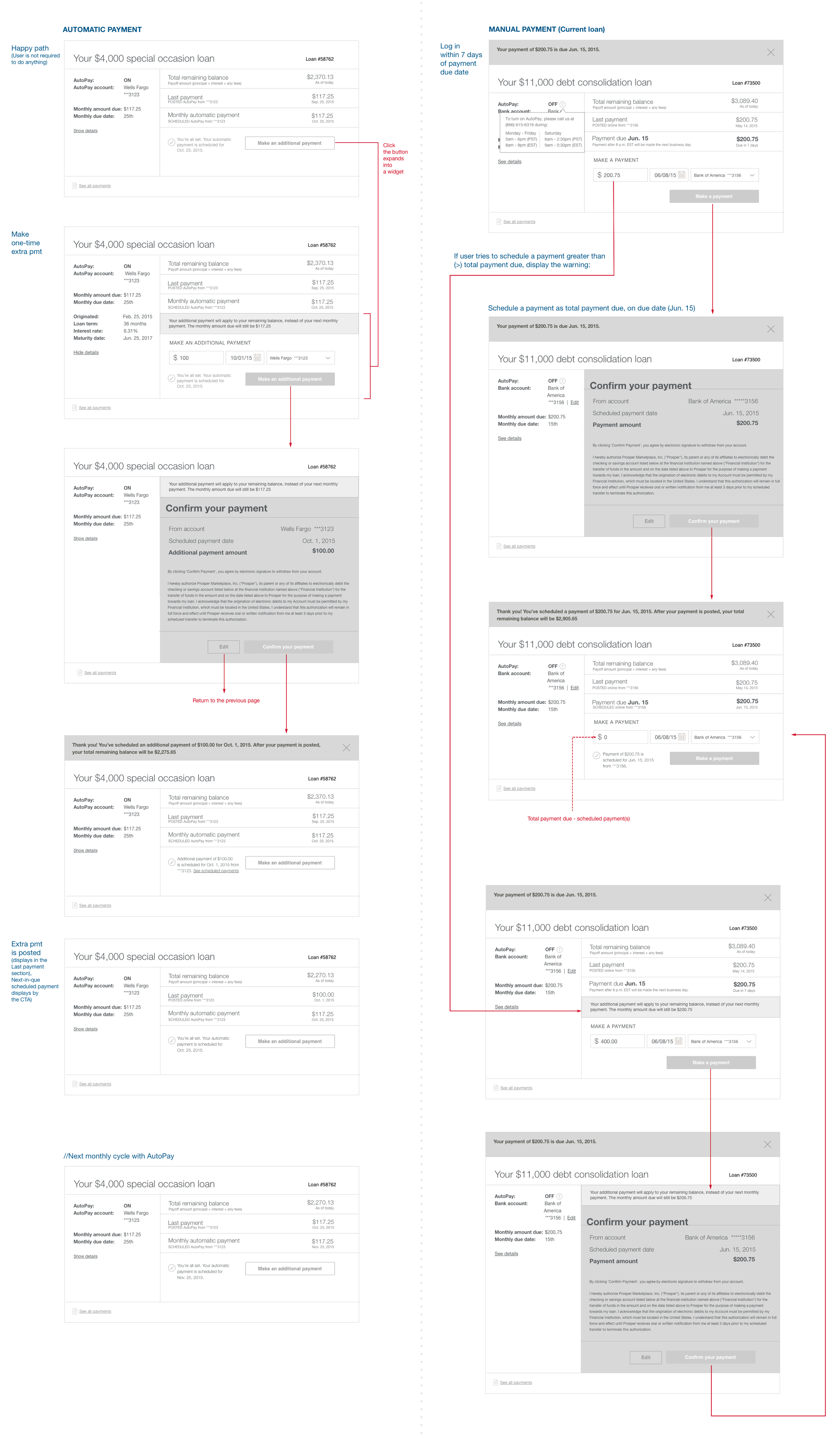
After we flushed out the user cases, we prototyped them and worked with our researcher to get them tested with users. We screened and conducted the testing sessions at the local office. Our cross-functional team also joined the live video sessions and attended the recap meeting. We iterated the design according to the insights that we received.
Deliverables
This was a special case project. Due to an overlap with the rebrand launch, we partitioned this project into two phases: reskin (interim state) and rebrand (overhauled until the completion of the marketing site). Consequently, we provided two sets of deliverables for those time frames.
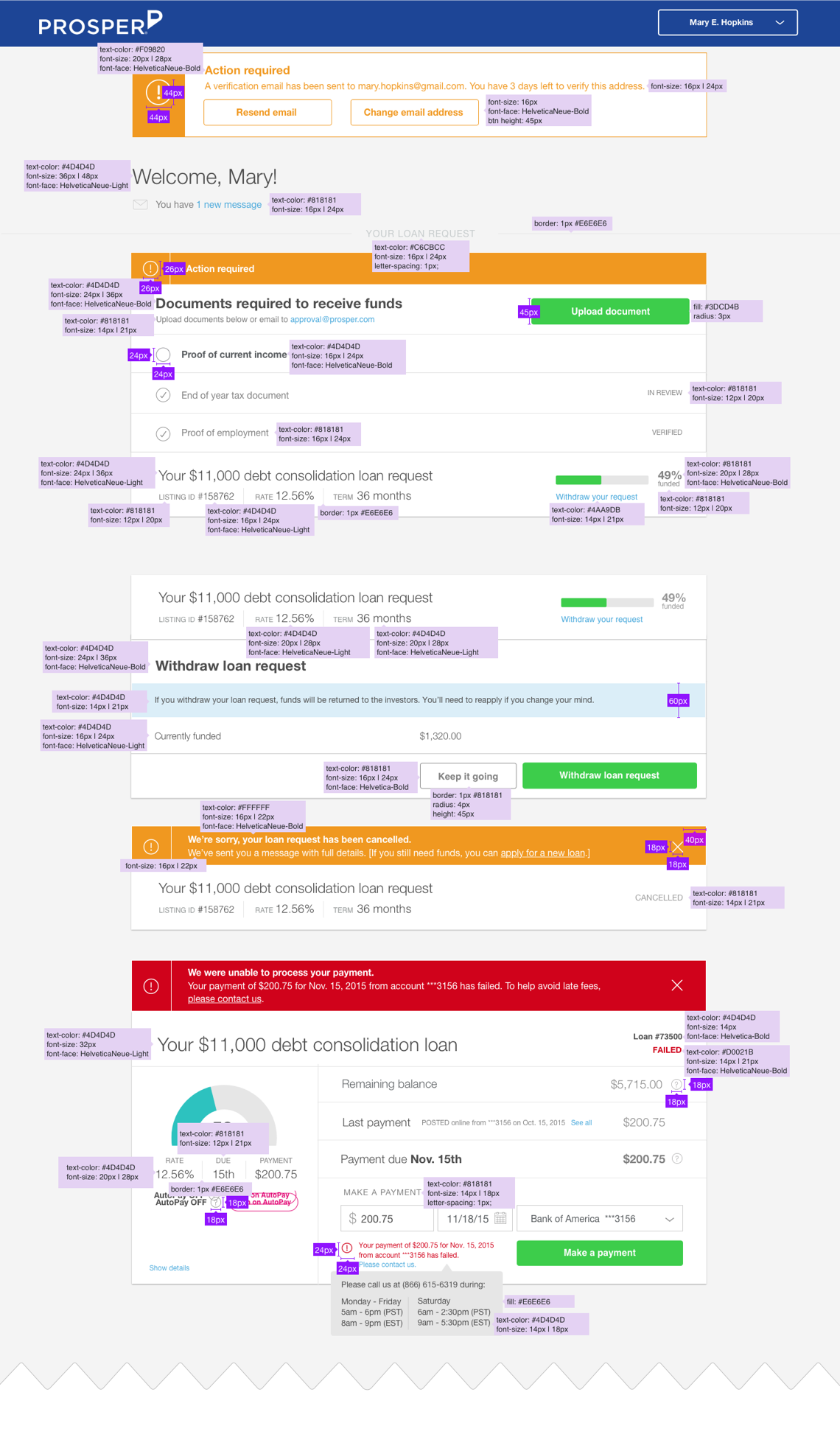
← [LEFT] Sample screen of a deliverable (with design specification) to the front-end engineers. Note: this was our manual practice before we adopted Zeplin as our team collaboration tool.
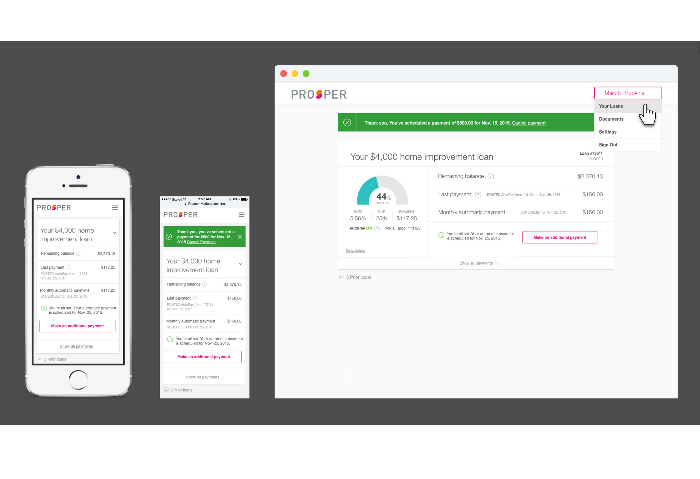
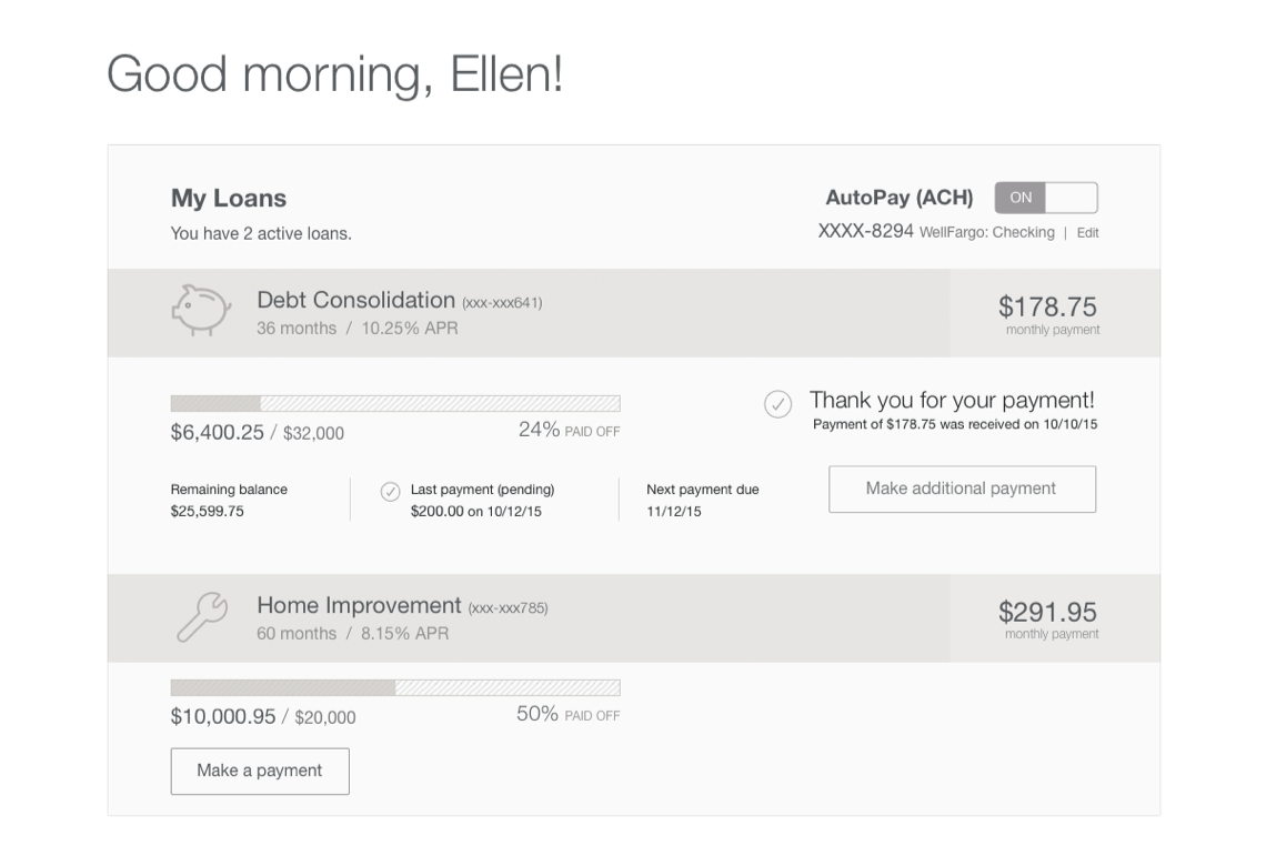
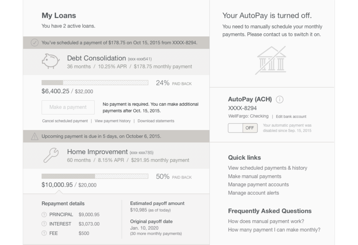
↓ [BELOW] Phase 1 ("Reskin") final product, which was also responsive for multi-devices.
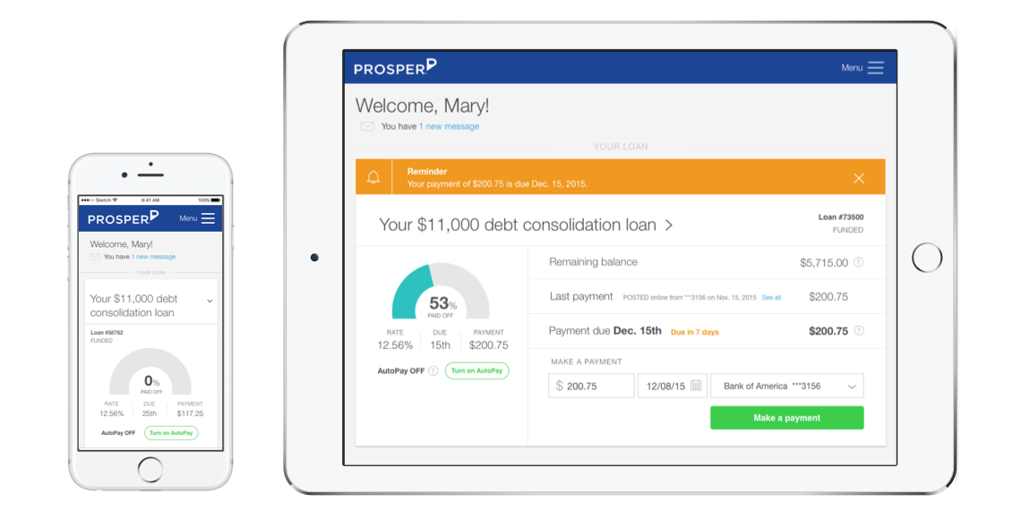
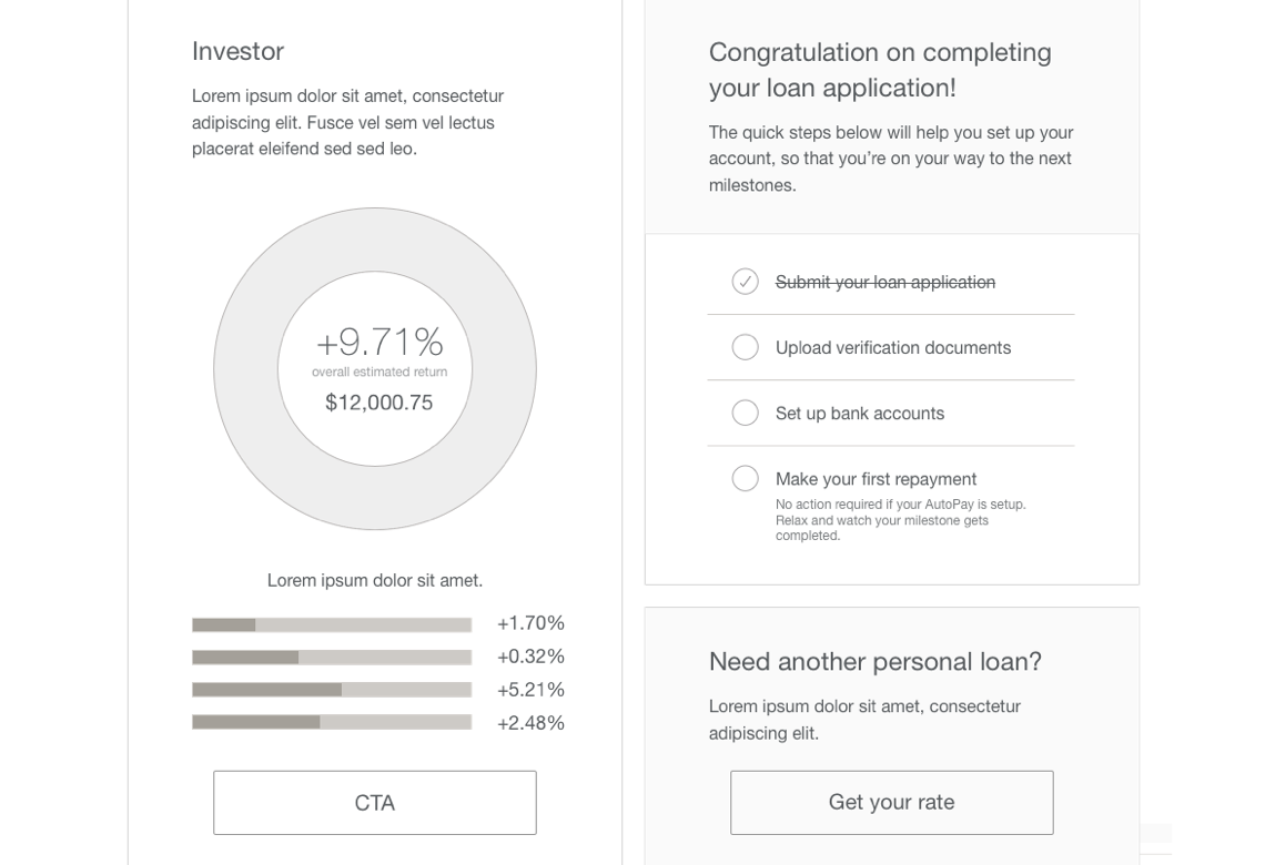
After a successful launch of the marketing site and our Phase 1, we launched our Phase 2 dashboard. This project has become a living project for our Servicing team as we continue to optimize and improve it upon the feedback we've received from our users.