Prosper Healthcare Lending (PHL)
Healthcare financing project. Prosper acquired American HealthCare Lending, a leading patient financing platform, in 2015. I was the lead designer to help integrate and bring a consumer-friendly and disruptive option for financing elective medical procedures to an industry.
- 2015-2016
- UX, UI, IA, Research, Testings
- Design Lead – Healthcare Financing
Designed to Make Healthcare Affordable
PHL was a part of our ecosystem team, whose goal was to expand our products into new vertical markets, including healthcare and home improvement. It's one of the long-term growth strategies that makes the loan offers available to more borrowers with various needs.
PHL was my first acquisition-integration design project to lead.
To promote collaboration, I worked very closely with a product manager from pre-acquired PHL and a Director product manager at Prosper. We had two-week sprints, product reviews, as well as user research/usability testing sessions.
The PHL projects that I led include revamping of the Provider Dashboard / Portal and the borrower funnel
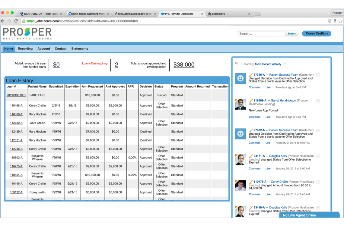
← [LEFT] Sample screen of the pre-redesigned Provider Dashboard hosted on Salesforce1.
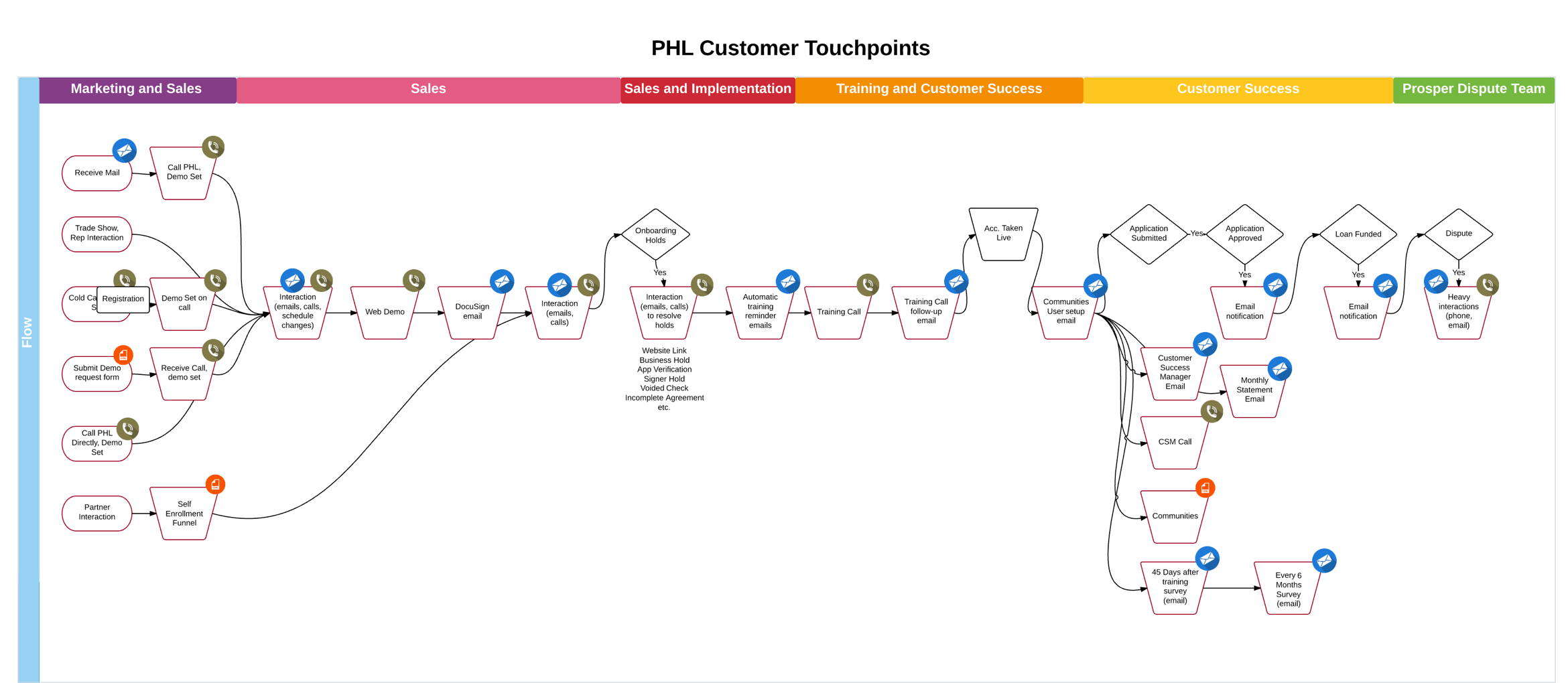
↓ [BELOW] The end-to-end healthcare provider ("PHL customer") touchpoints.
PROJECT: PROVIDER DASHBOARD / PORTAL
I redesigned the dashboard from the ground up. The previous version was part of the Salesforce1 solution. Our plan was to build a new, useful, and scalable product (adaptable to other verticals) on the Prosper's internal platform.
Challenges
We identified that our current users didn't log-in the original portal because it was not useful to them. The system was considered complex and lacked of frequently-used functionalities.
Goals
The redesign goal was to simplify the product to better meet our user needs and to increase user engagement. Not only did it improve product experience, it also drove the revenues by increasing the numbers of loan applications and follow-throughs from our users, as they're our main patient financing advocates.
Process
To start, I jumped in and figured out how the current product worked. I gathered insights from our users (medical office managers and financial personnel), prioritized the use cases and findings, then designed and iterated accordingly.
During this process, our researcher and I traveled to our users' medical offices to conduct the contextual interviews and usability testing sessions. We visited various specialty-offices that offered elective medical procedures including dental, bariatric, and cosmetic surgery. The trip was informative as we learned a lot about our users' financing approach, processes, daily struggles that they have in their own settings.
Solutions
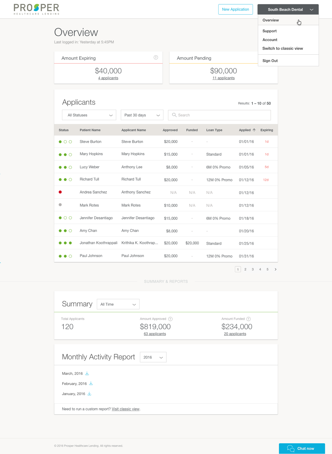
The dashboard redesign solved the two most important questions for your users: "How is my office doing financially?" and "What do I have to do to help my patients get financed so they can start their medical procedures?"
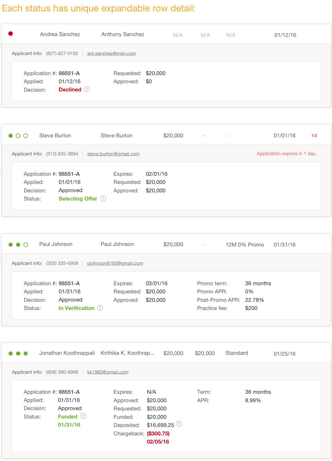
With that in mind, I created a snapshot of the office's loan applications info at the top. Served as a filter, the user could click on them to see the patients with an expiring loan application (they must follow up) and those with a pending (applied, but not yet funded) loan application.
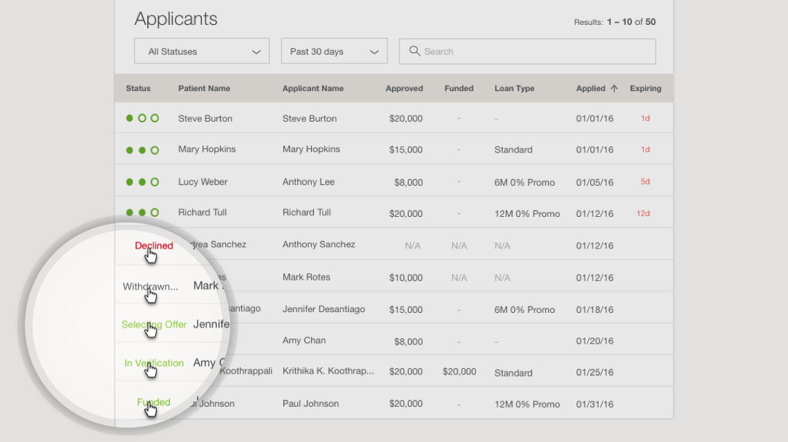
The 'Applicants' section was designed as a table to capture individual patient's loan application status. It's equipped with sort (default: expiring loan applicant on top) and filters (default: 30 days, because that's the time applications remain active). I also created the 3-dots-systems status to reflect the current application process and improve scannability for the users. This simple code instantly communicated to users the progress and helped them determine the next steps for each patient.
Reports and total financial summary section were placed at the bottom. This was because our users looked at them less frequently–about once a month (or less often) when they're doing account reconciliation with their financial system.
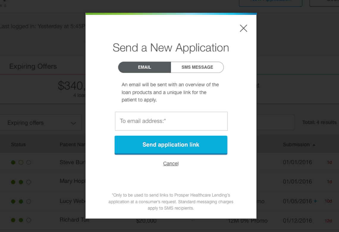
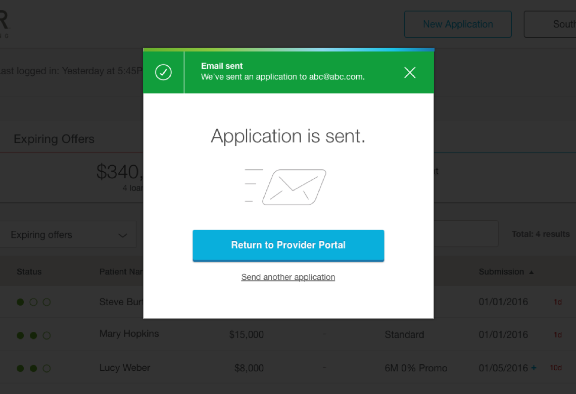
Lastly, the 'New Application' button was added as a visual cue to facilitate the users to jump start the application process. When a patient expressed interest in applying for financing, users could simply send the patient a text message or email containing the link to the application page right from this dashboard.
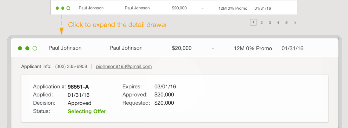
↓ [BELOW] Interactions for the Applicant table. Users can hover over the status and click on the row to see more detail.
As I wrapped up the project, I greatly appreciated the cross-team collaboration of product management, engineering, customer service, and business units. Together, we meticulously evaluated details to create a holistic user experience of the dashboard. We learned what worked well, what didn’t, and what was missing. Combining the research and design methods, we developed a clean, easy-to-use platform to quickly and efficiently provide all the information our user needs.
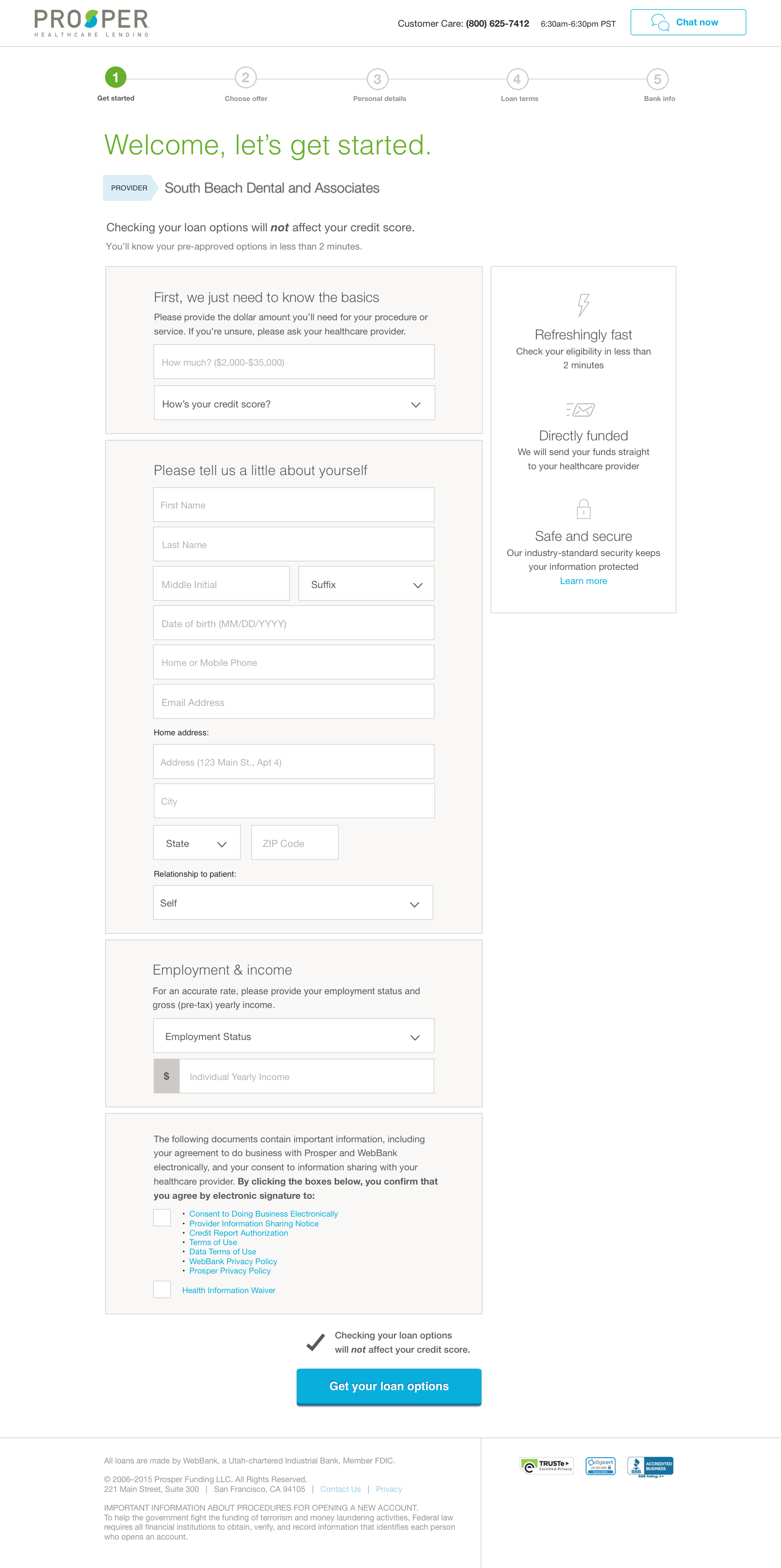
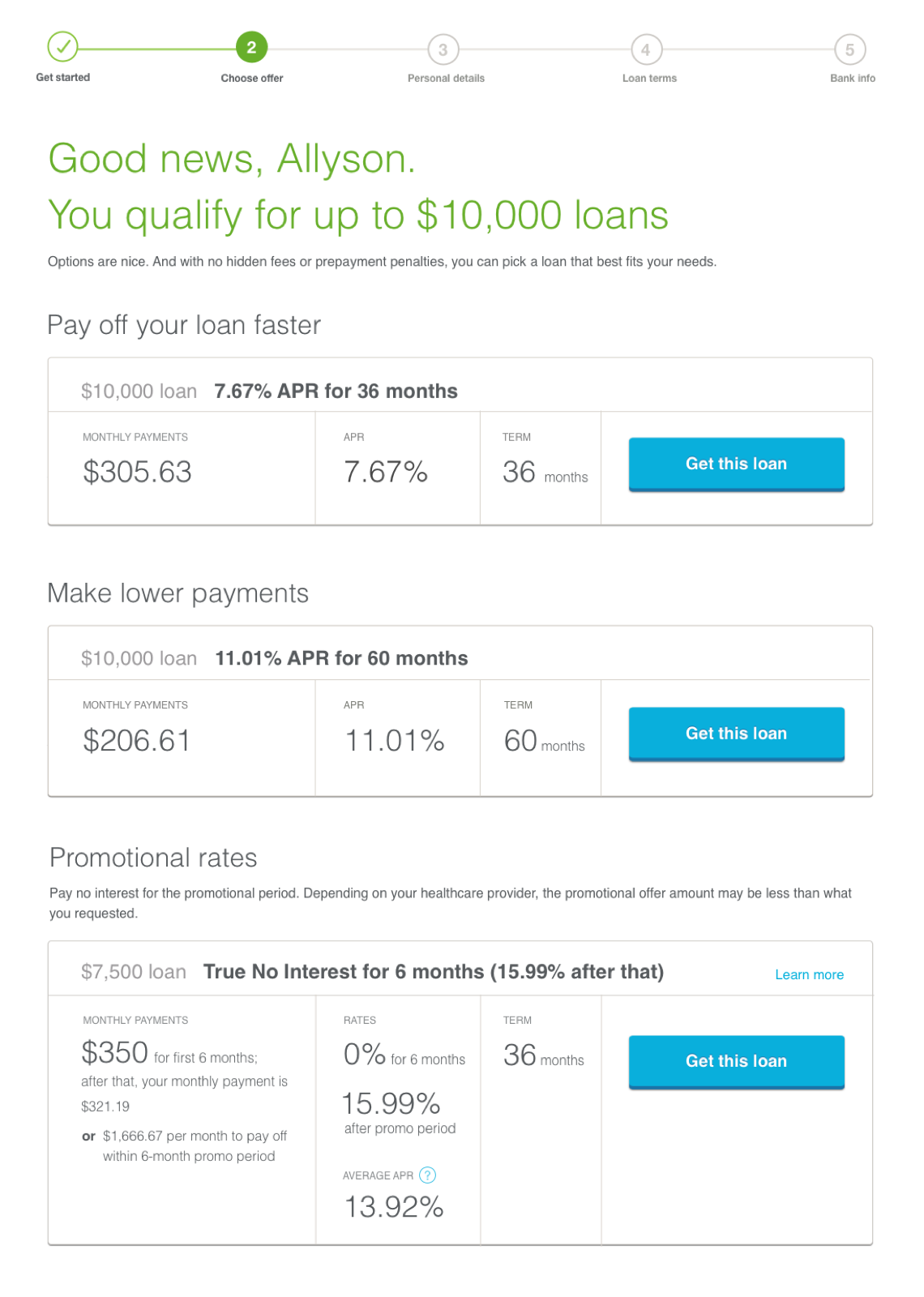
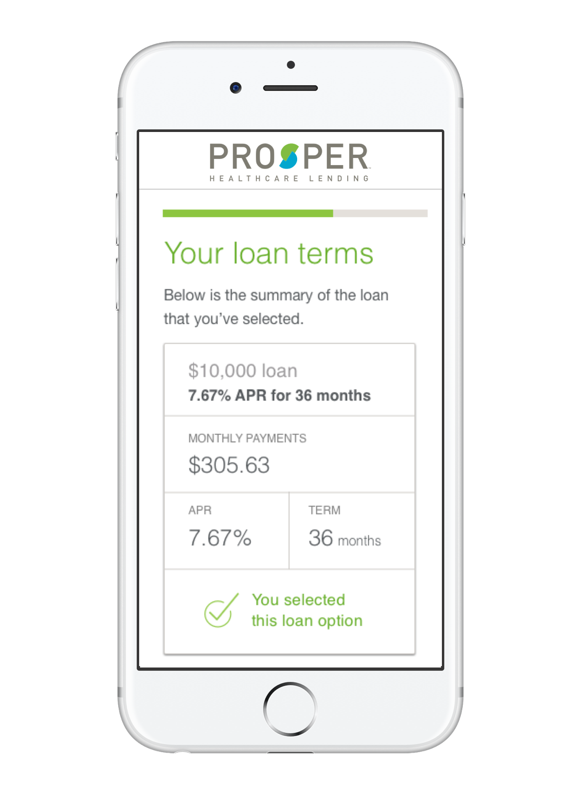
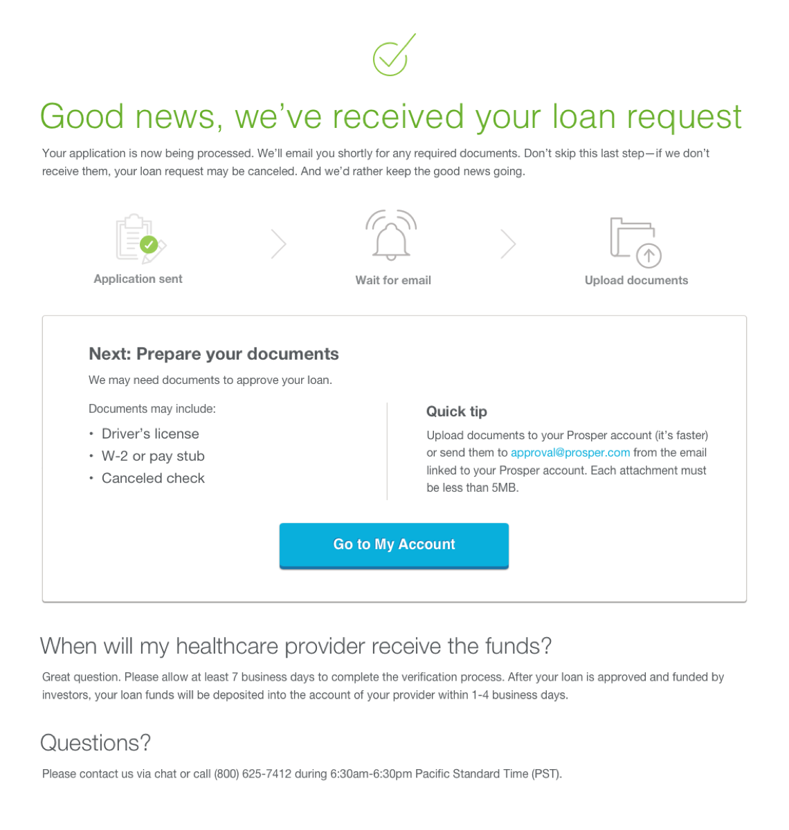
PROJECT: PHL PATIENT / BORROWER FUNNEL
Designed to be responsive, I revamped the entire loan application funnel experience as it was also tightly integrated into the legacy Salesforce1.
I optimized our funnel pages and incorporated the new PHL branding to strengthen the cohesiveness between the Prosper brands.
Following the build-measure-learn process, our researcher and I conducted the moderated usability testing sessions at our local office and iterated the design solutions accordingly.
Design is in the Details
This project was carried out with a mindset to optimize every detail in our application process. Seemingly a series of simple pages for our users: Provider ID, Registration, Offers, Personal Details, Truth in Lending Act (TILA) Document, Bank Info, Thank You. We went through many reviews, iterations, and testings to ensure that what we built was with an intention and purpose to serve our users and business. This was the beginning of the latest company-wide funnel redesign. It was a major stepping stone of an overall improvement, in which set a higher standard of advocating for our users and for an impact of the User Experience team in our company.
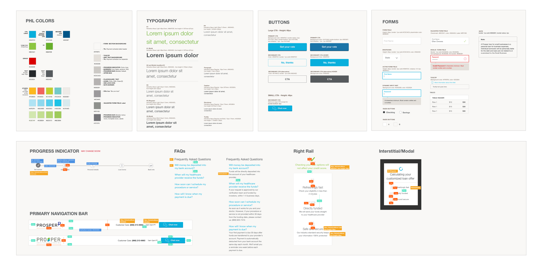
↓ [BELOW] A living style guide that I created as part of the PHL integration/rebranding effort.